MY HOME RENOVATION PROJECT PART 2
Clapham in Summer is great, single in Clapham in Summer is even better! So the rush is on to get the flat ready for the inevitable Giggerlum after parties, although shoes off please! If you haven't already read the first part of the renovation, which was my bedroom and the hallway, you can view it here. During the last month, I have been decorating the spare bedroom and the bathroom. The spare room was quite easy, as it just required a bit of paint and new interiors however the bathroom was a major project - ripping our old tiling, flooring and starting from pretty much scratch.
THE SPARE BEDROOM
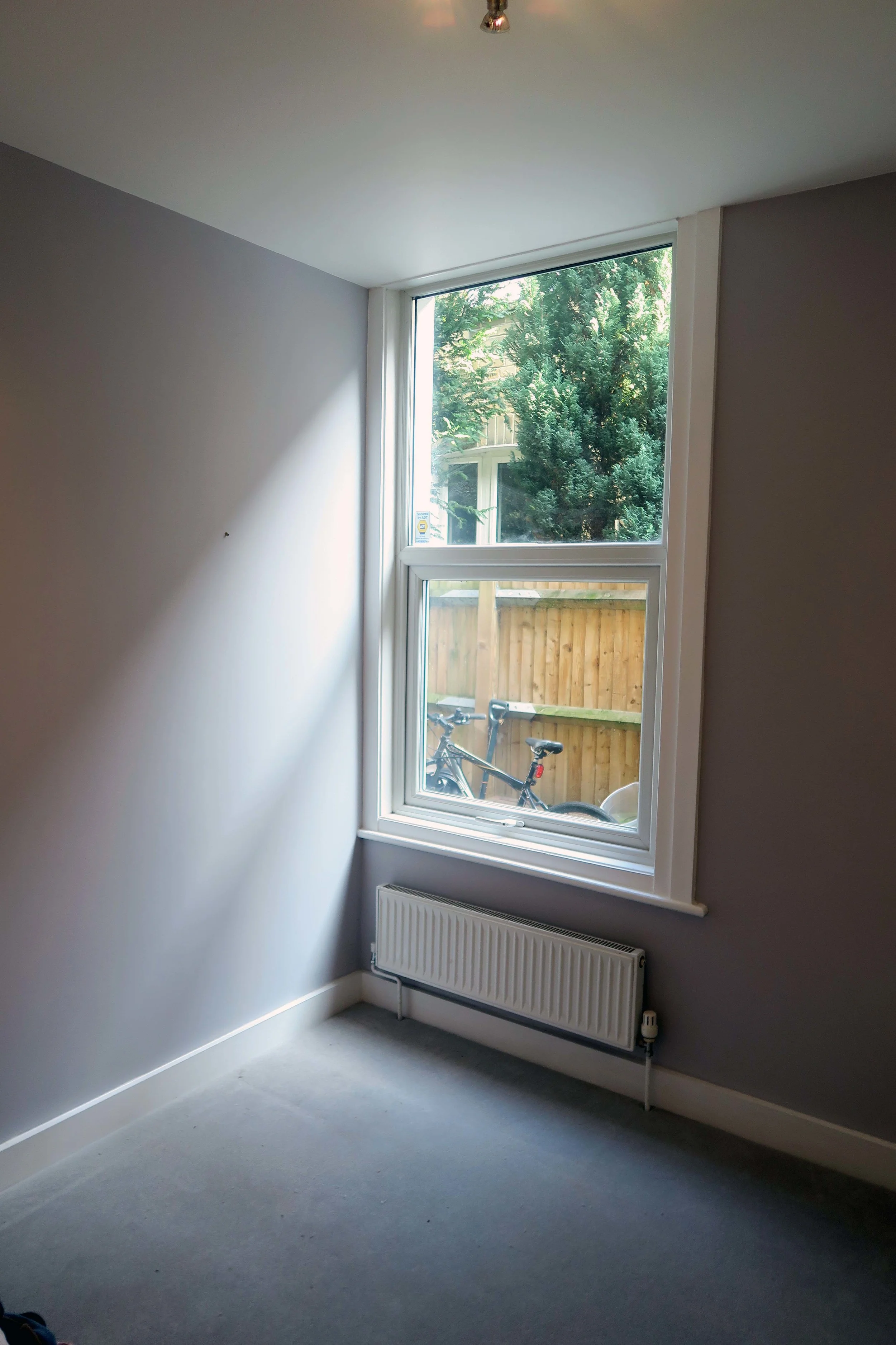
Since I moved to my Clapham flat about 6 years ago, I have always rented out the second bedroom...so I haven't had time to decorate it at all but now it has been empty for a while so finally its time to spruce it up a little. I started off by removing all of the furniture, put some carpet down and painted the walls.
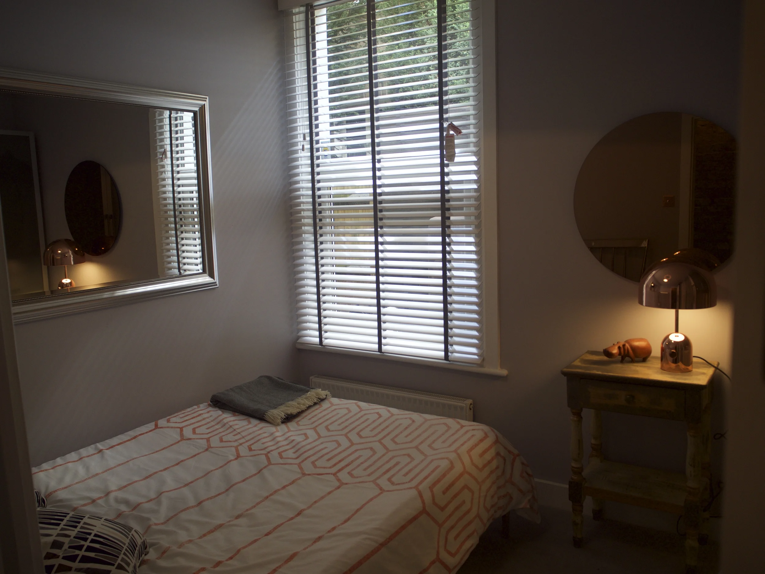
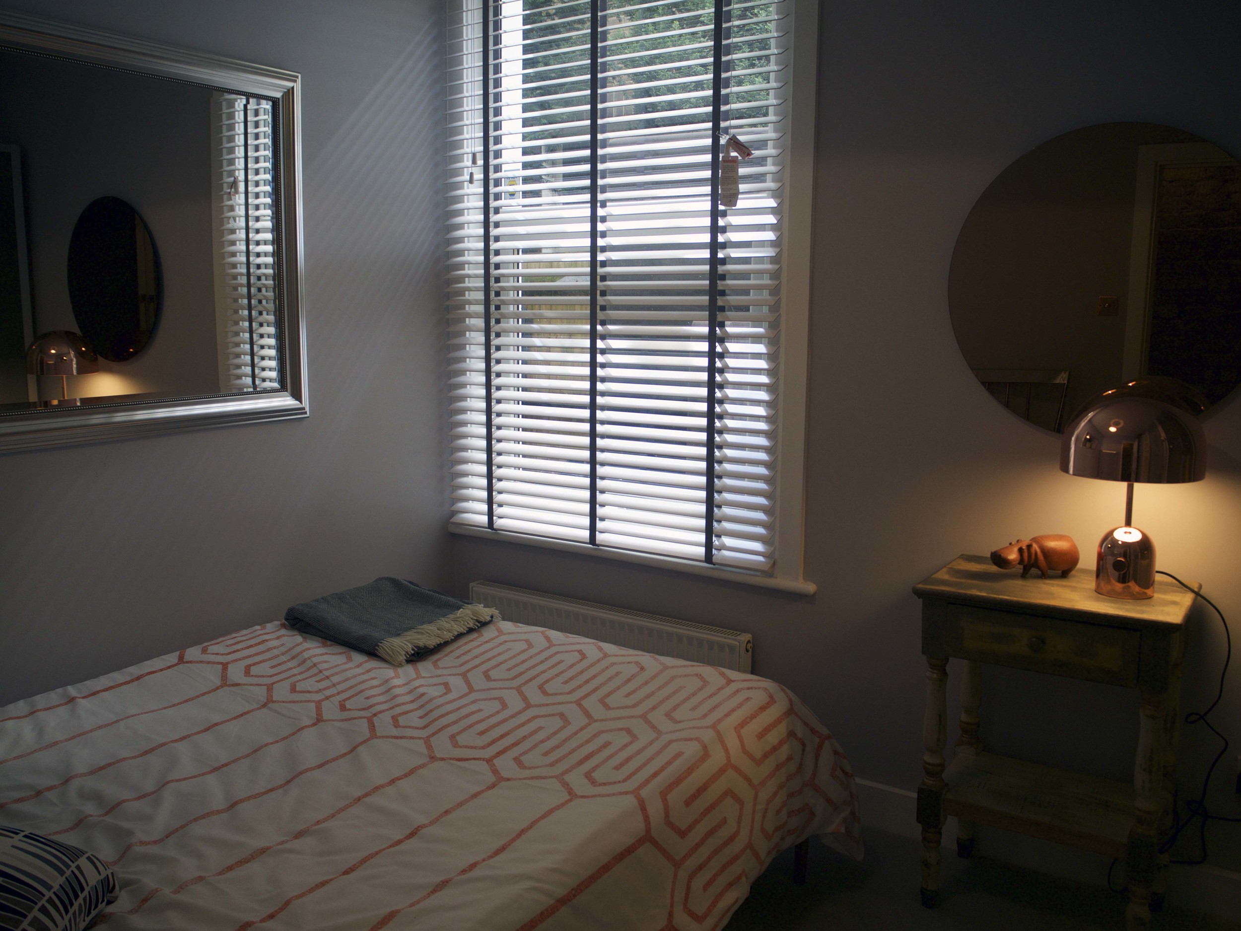
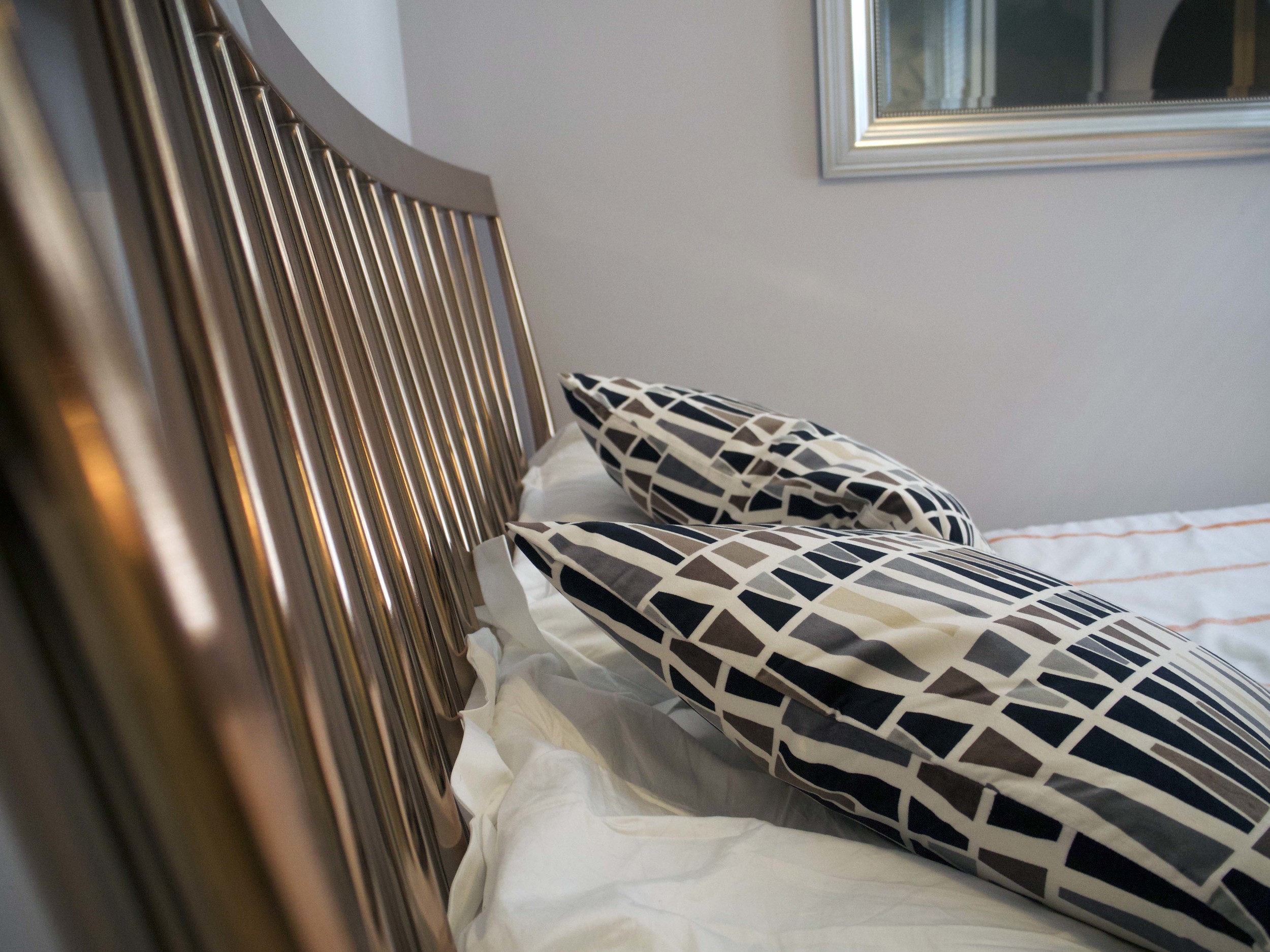
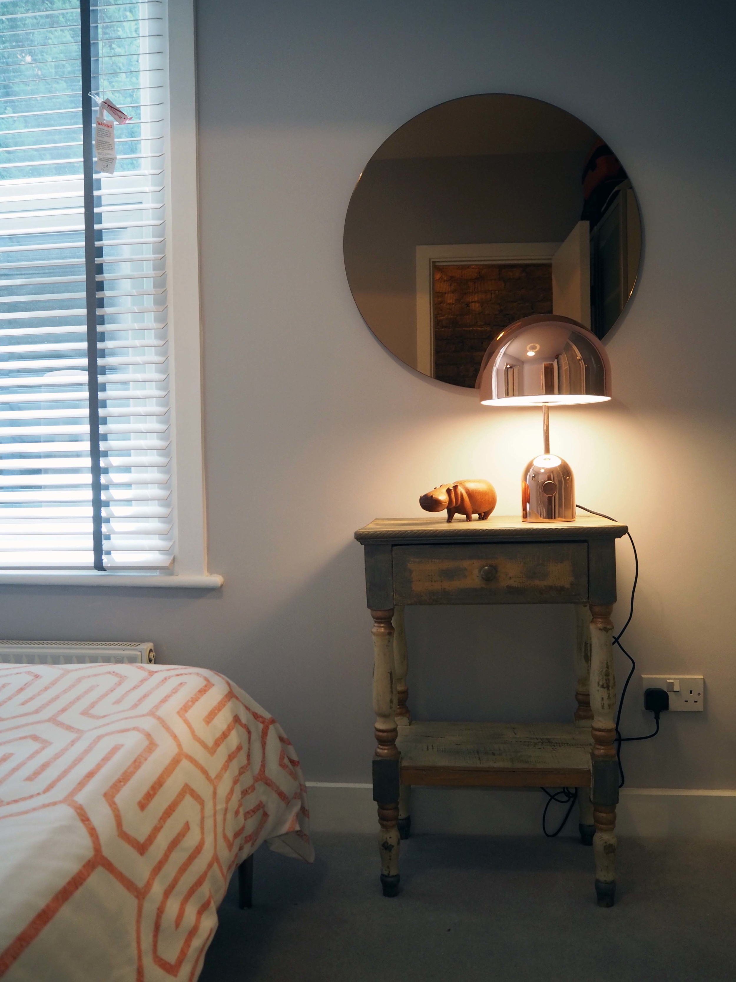
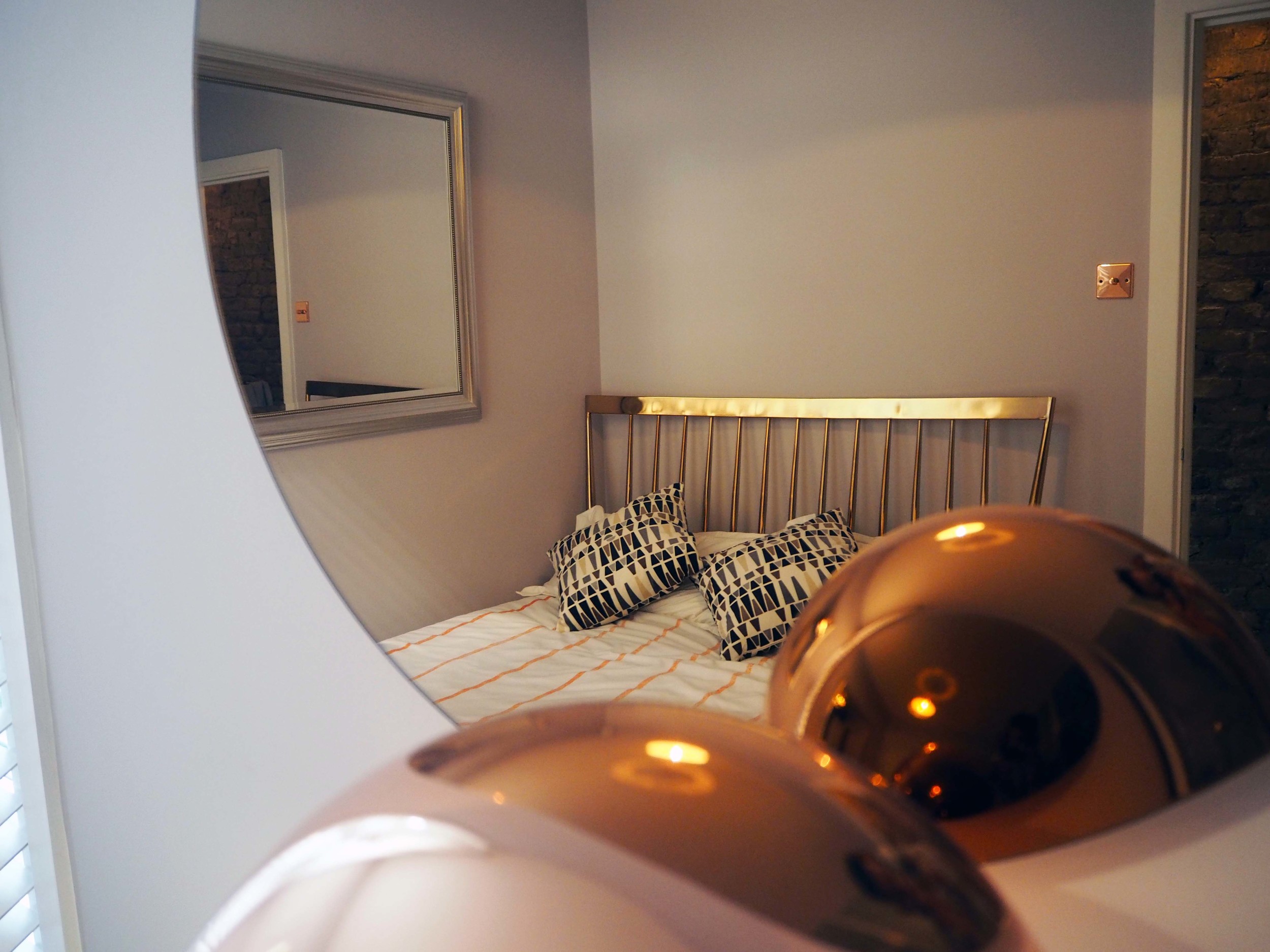
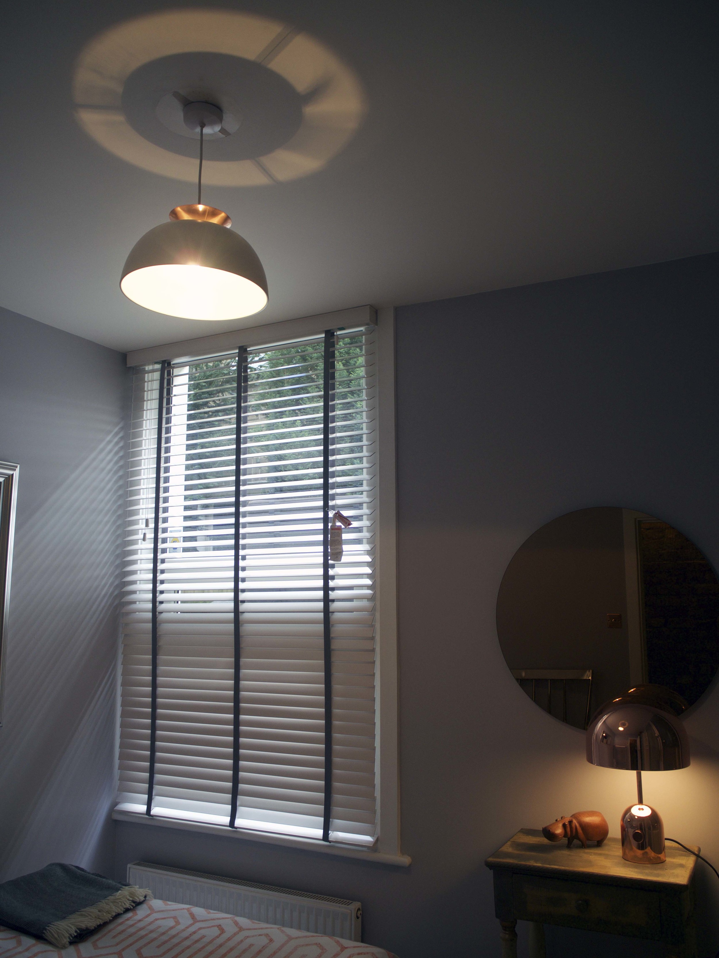
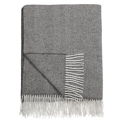
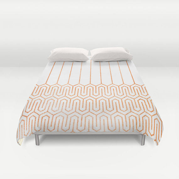
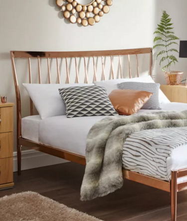
The theme that I have gone for in this room is modern copper and grey tonal colours with geometric prints. The only thing I've reused was the silver framed mirror (left hand mirror in the below picture) this was from Ikea, but now discontinued. After lot of searching, I managed to find this copper bed frame from Dreams which was reasonably priced at £299. The copper geometric bed covers are handmade from America via Etsy by a brand called Saudade Prints. Pillows are from John Lewis as well as the grey herringbone throw.
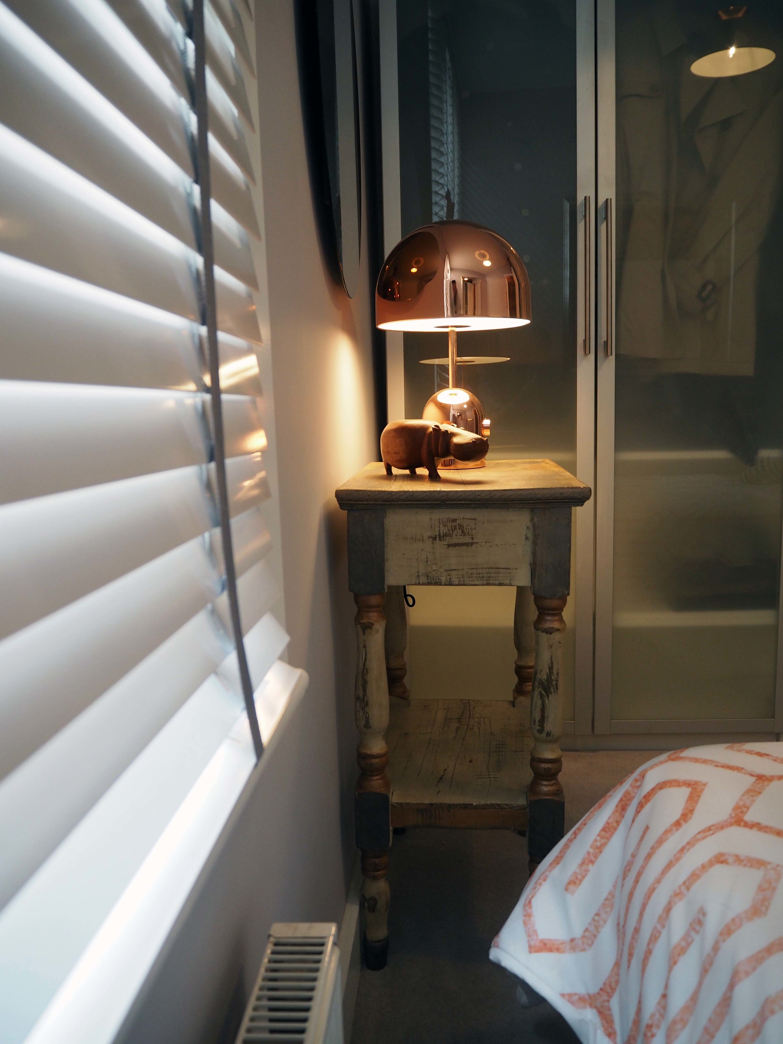
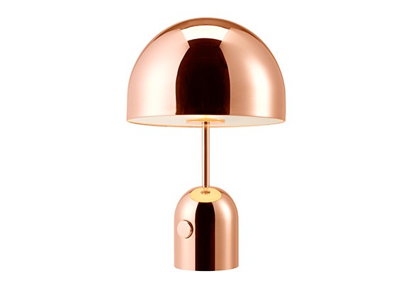
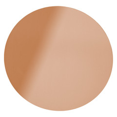
I've used the same style blind as I did in my bedroom, which are made-to-measure from Next. One of the hardest items to source was a vintage wooden side table, but I wanted it to have copper and grey hints to it...luckily I stumbled on this antique reclaimed table from Little Tree Furniture, they create one off pieces of up-claimed furniture. The lamp shade was again from John Lewis. Finishing off the copper theme, I found an amazing copper round mirror from a local shop in Clapham Old Town called Places & Spaces. My favourite piece is the Tom Dixon Bell Copper Lamp, perfect design and highly polished copper so reflects the light in the bedroom perfectly - giving the illusion of making the bedroom larger.
SHOP THIS INTERIOR DESIGN
THE BATHROOM
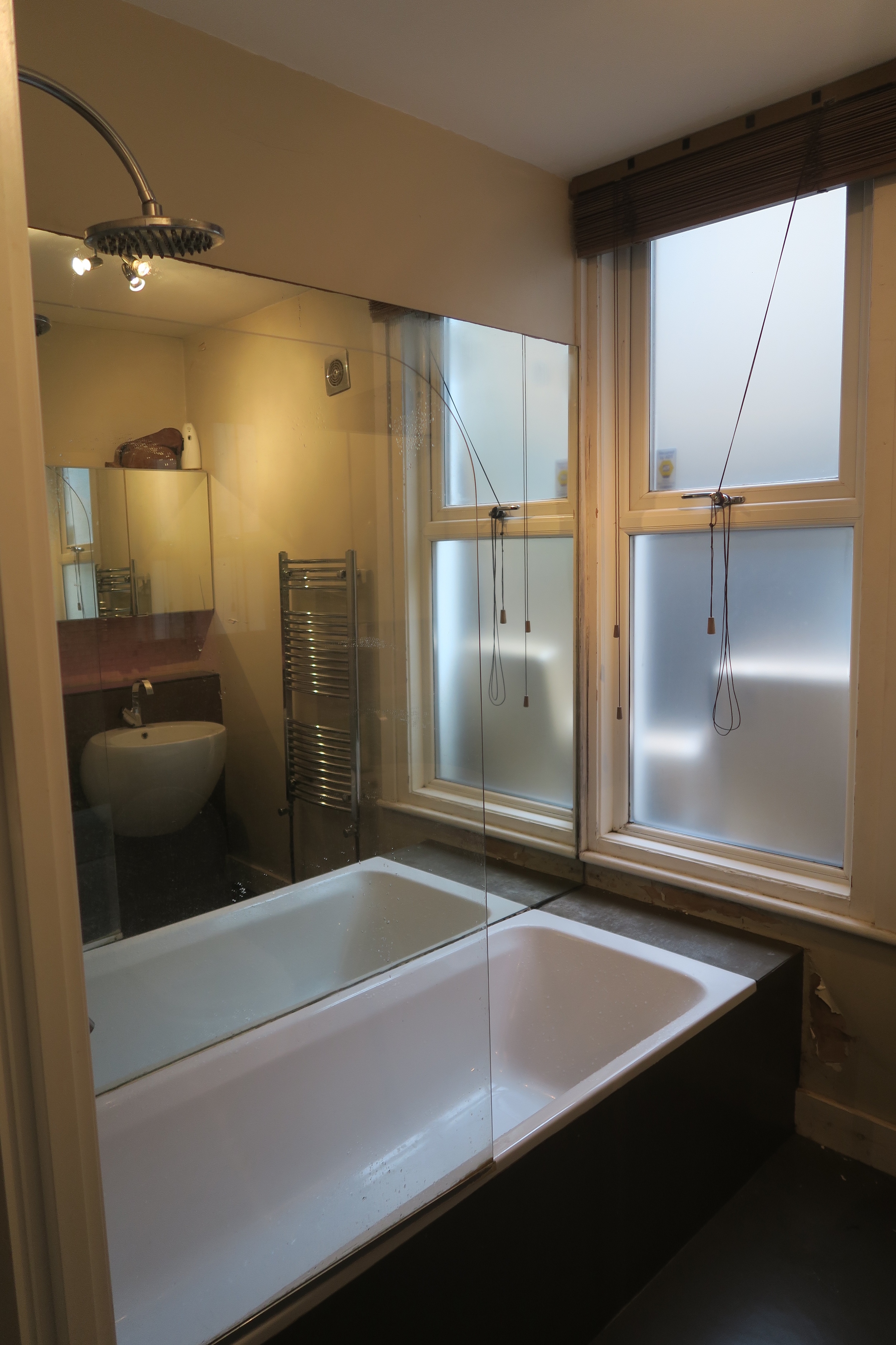
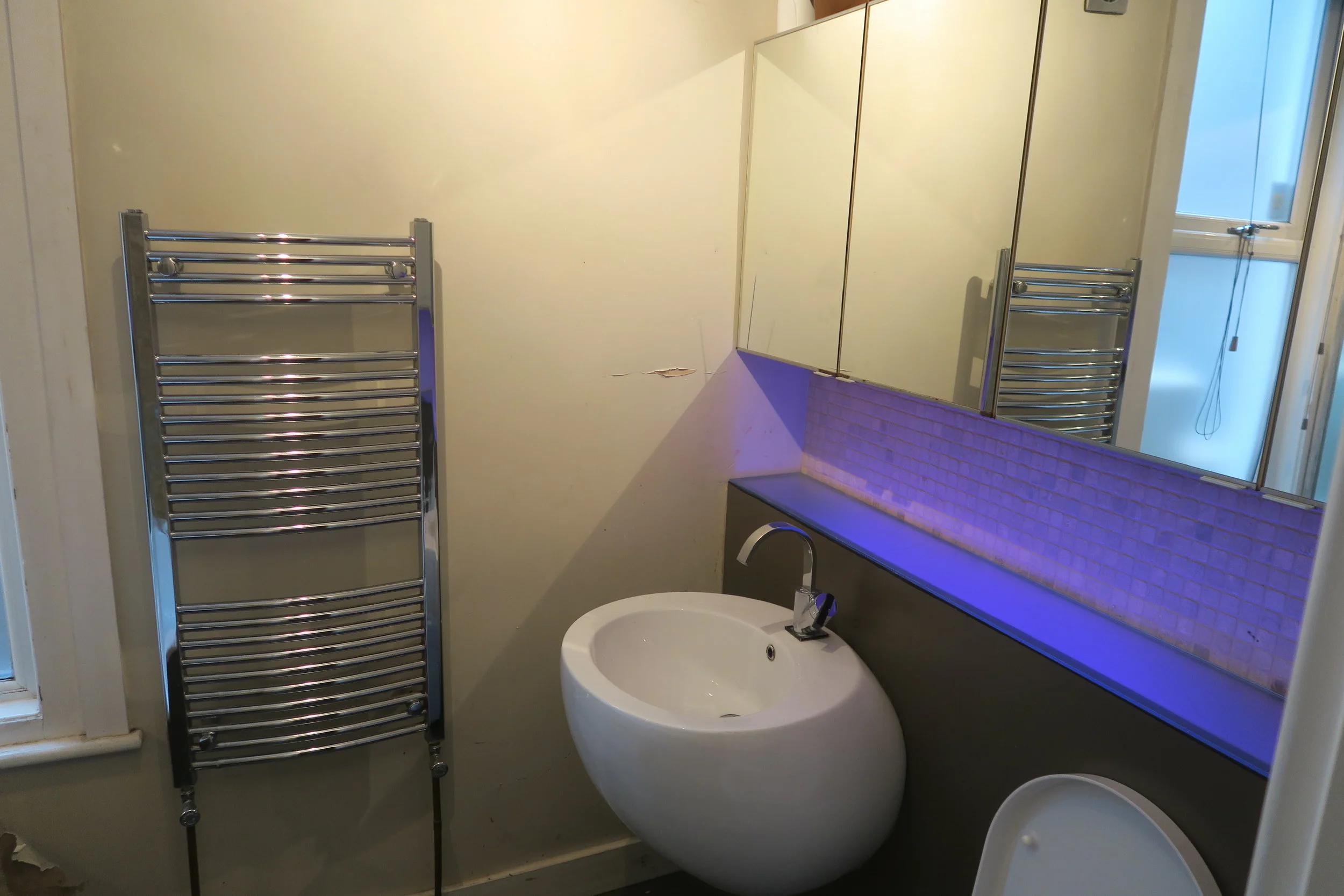
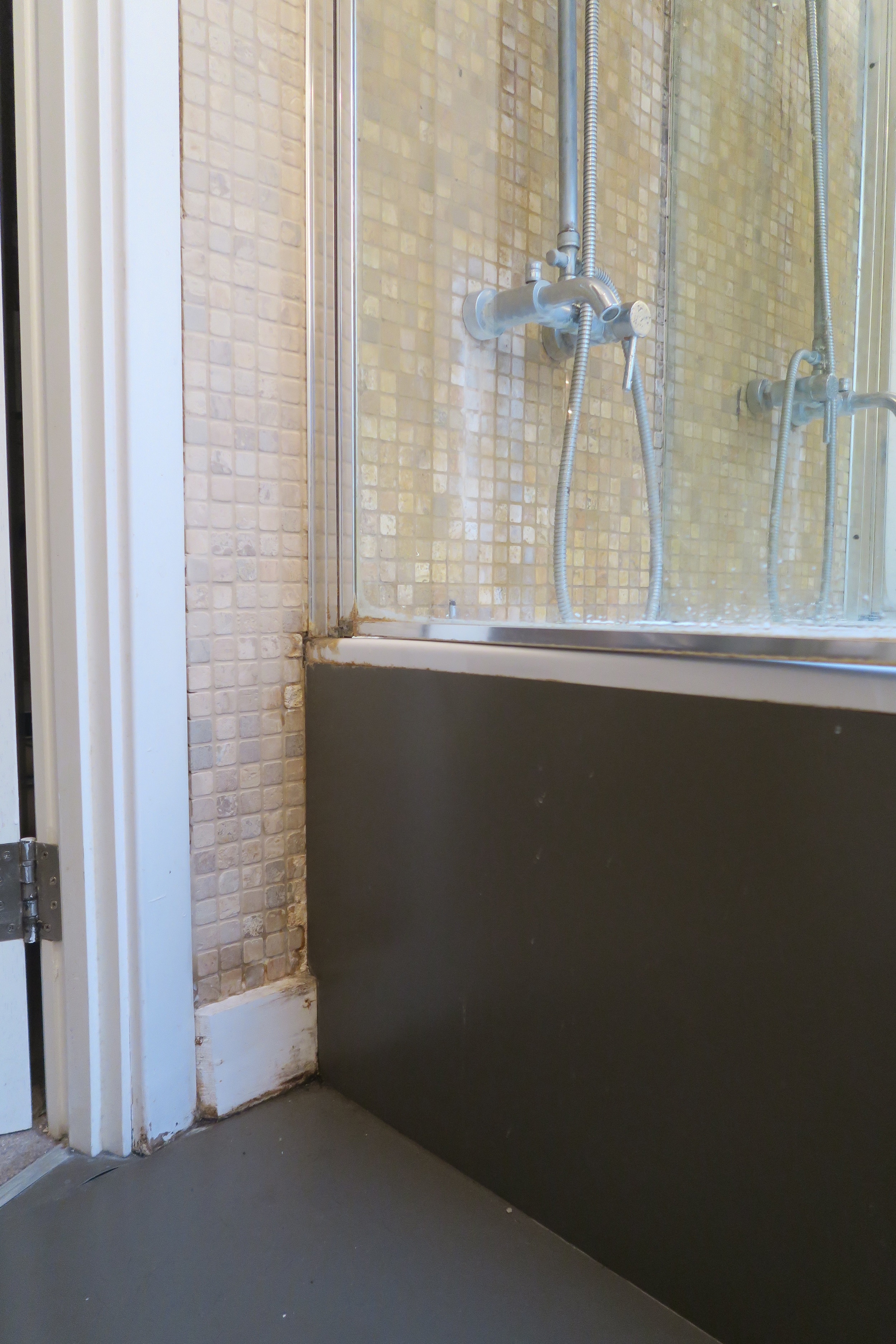
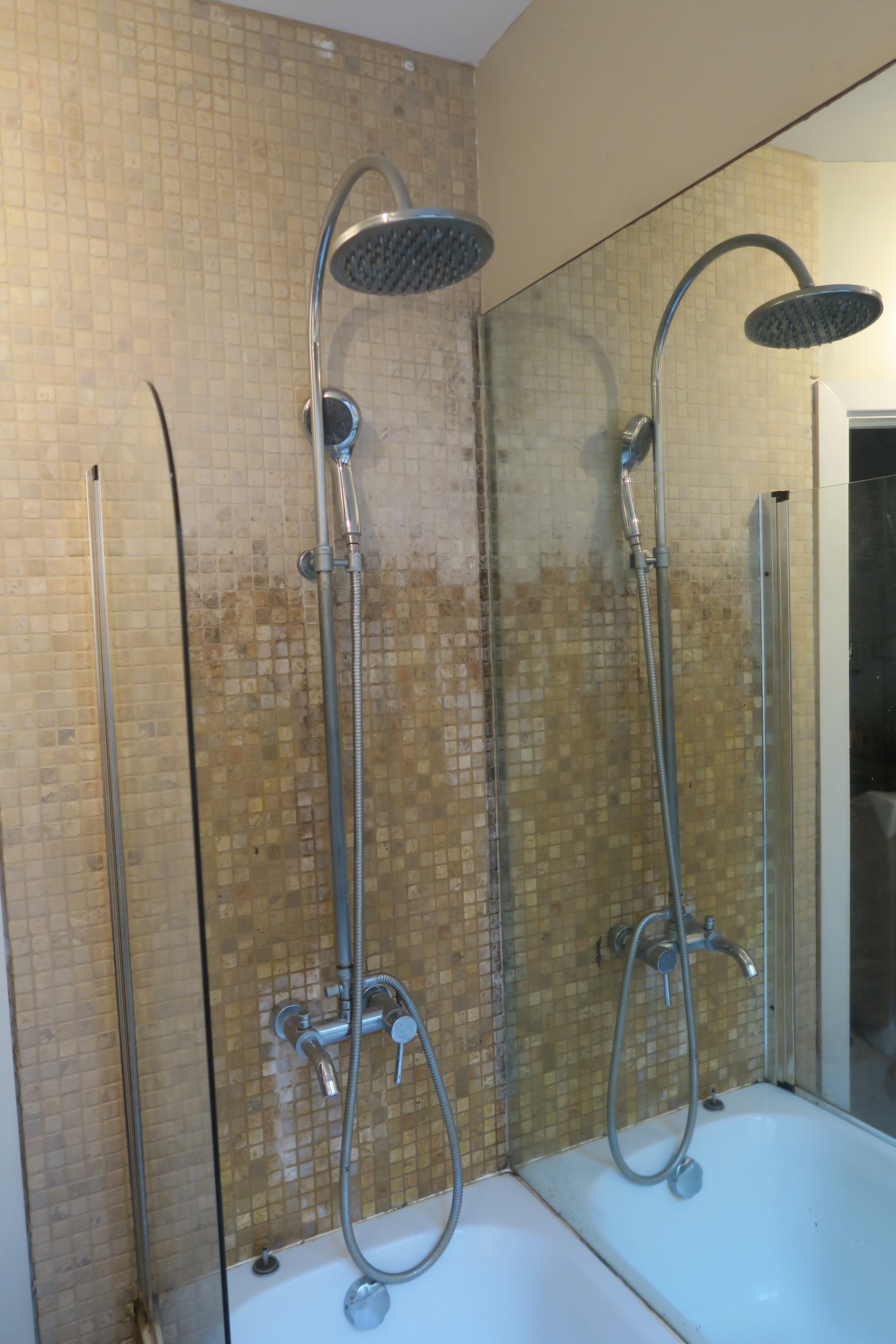
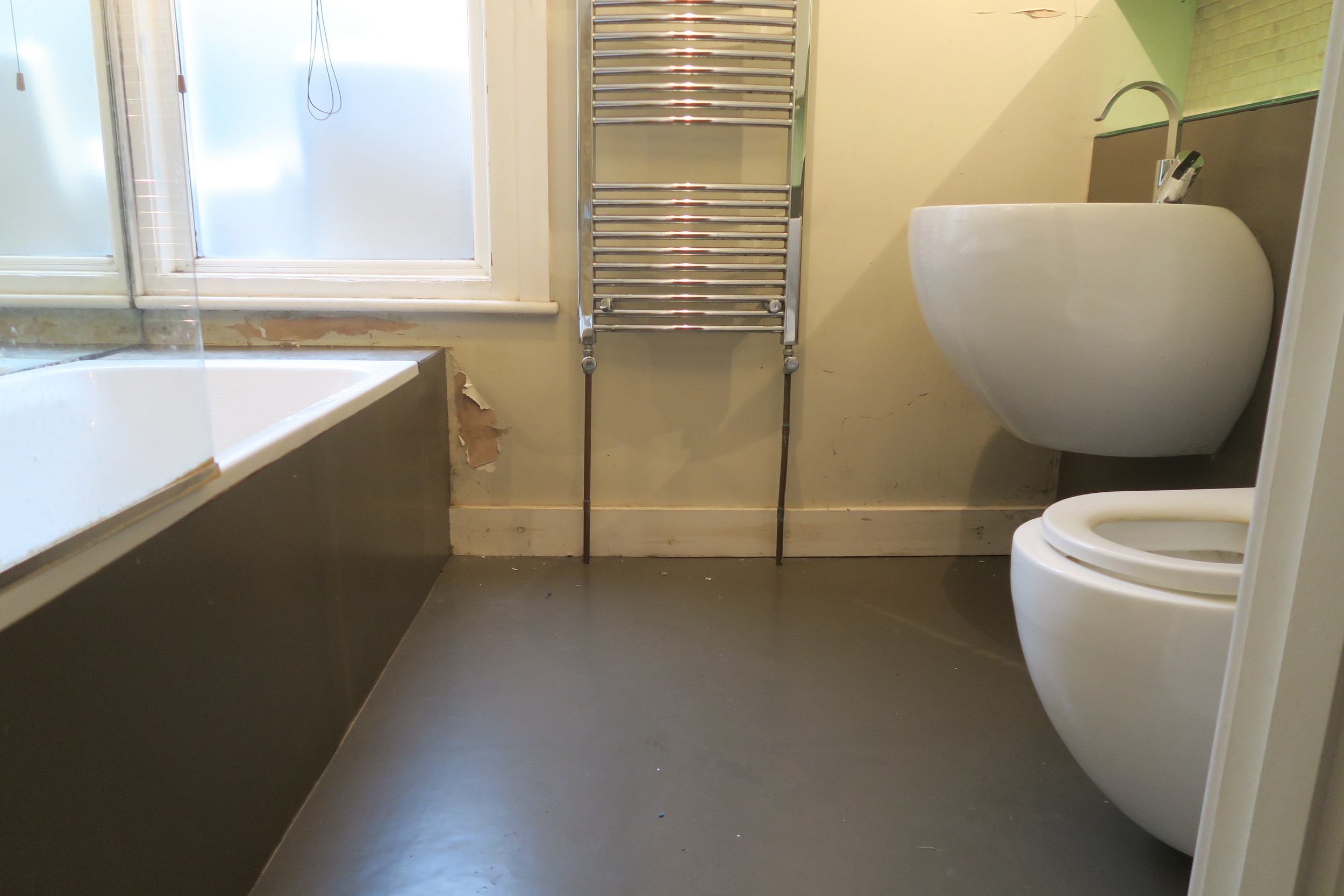
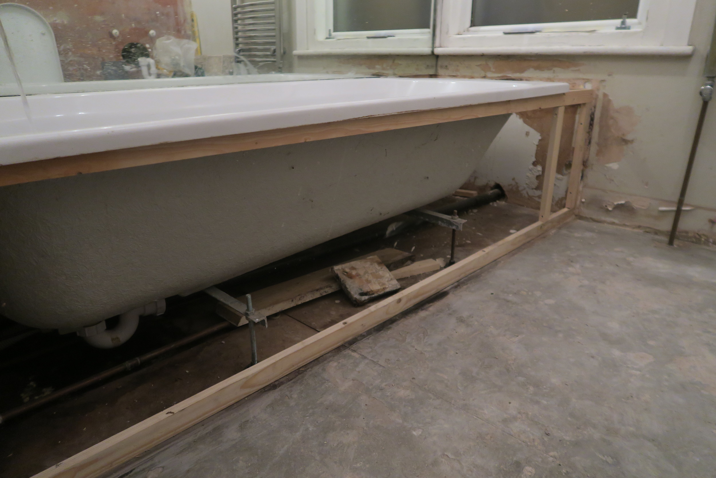
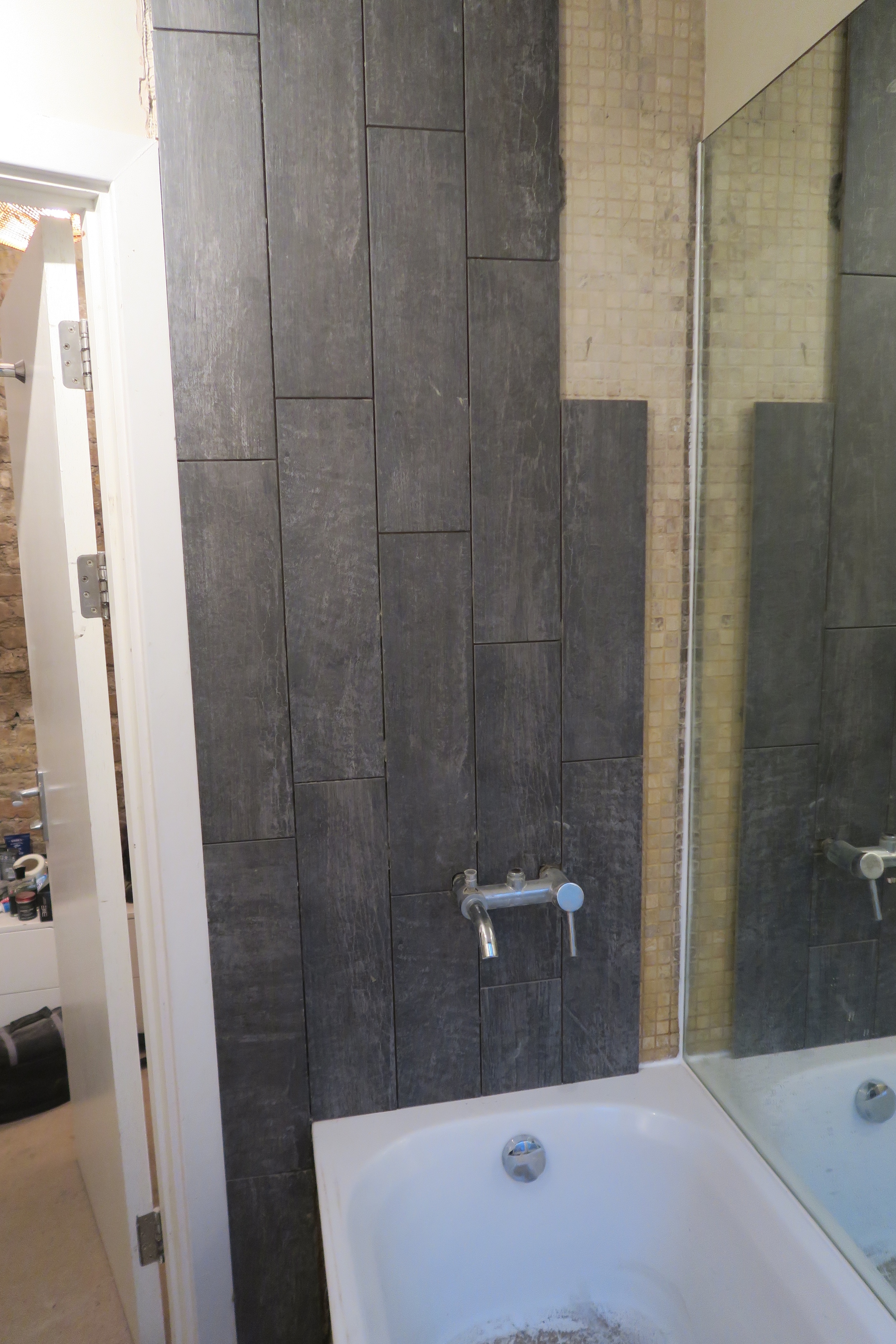
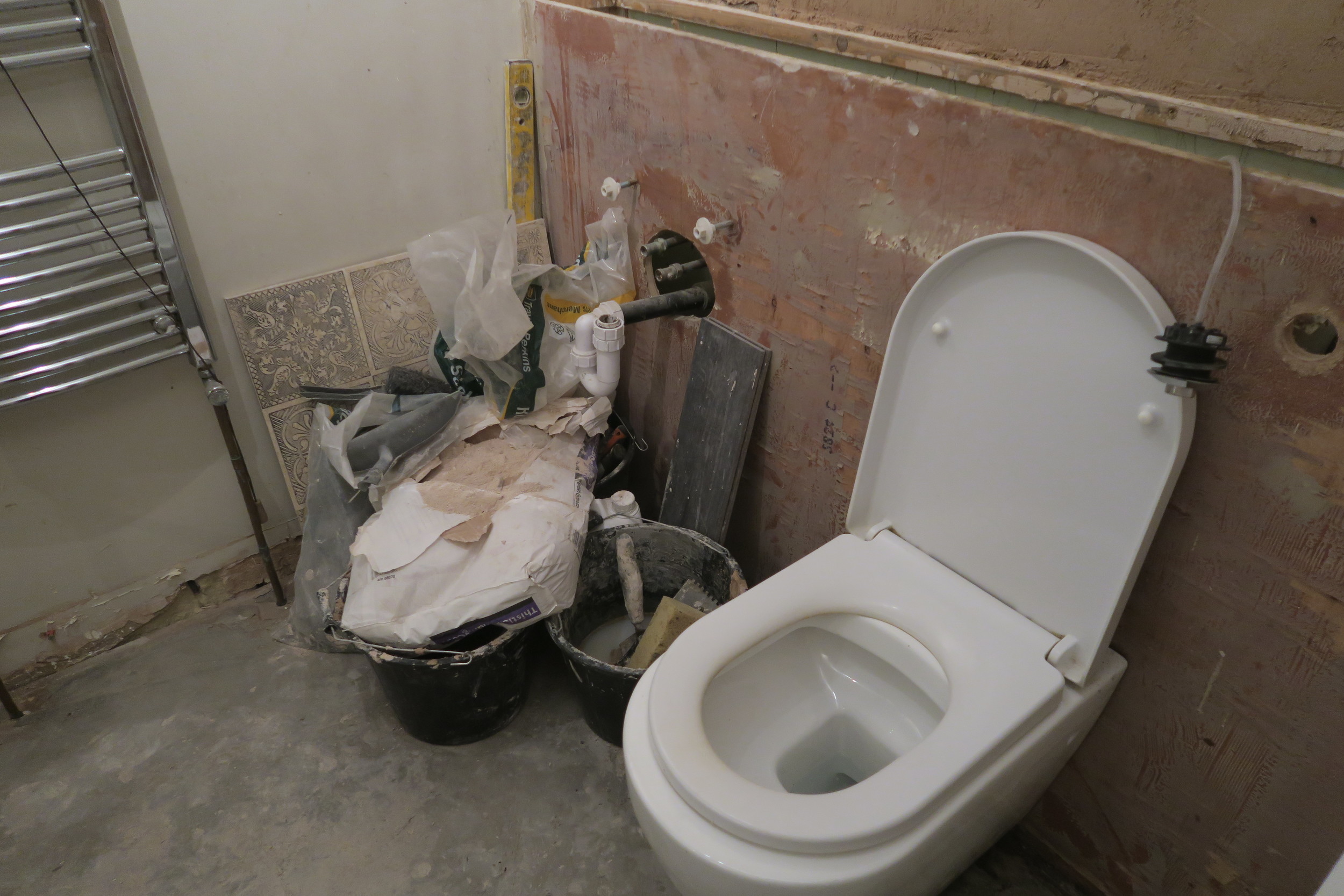
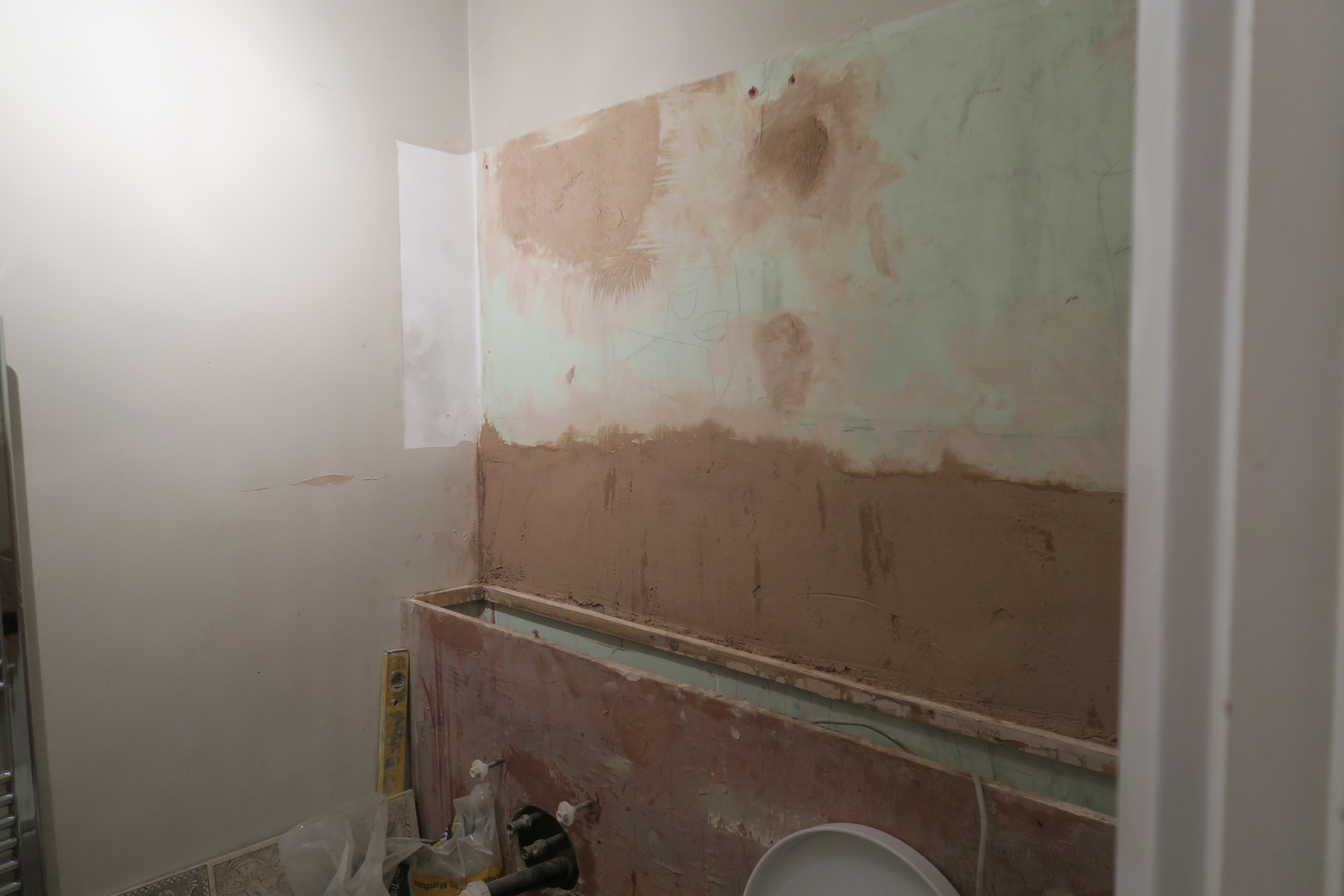
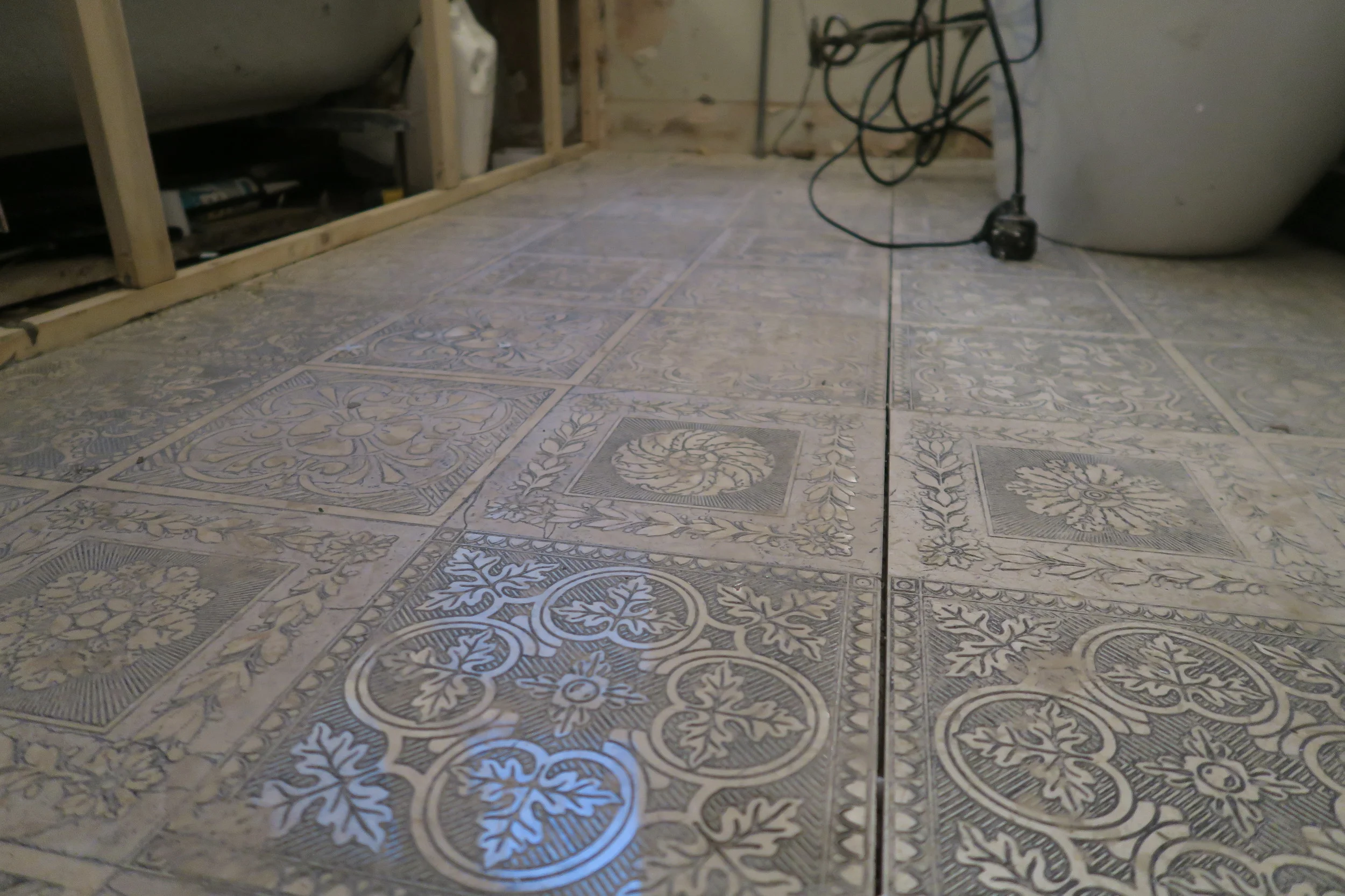
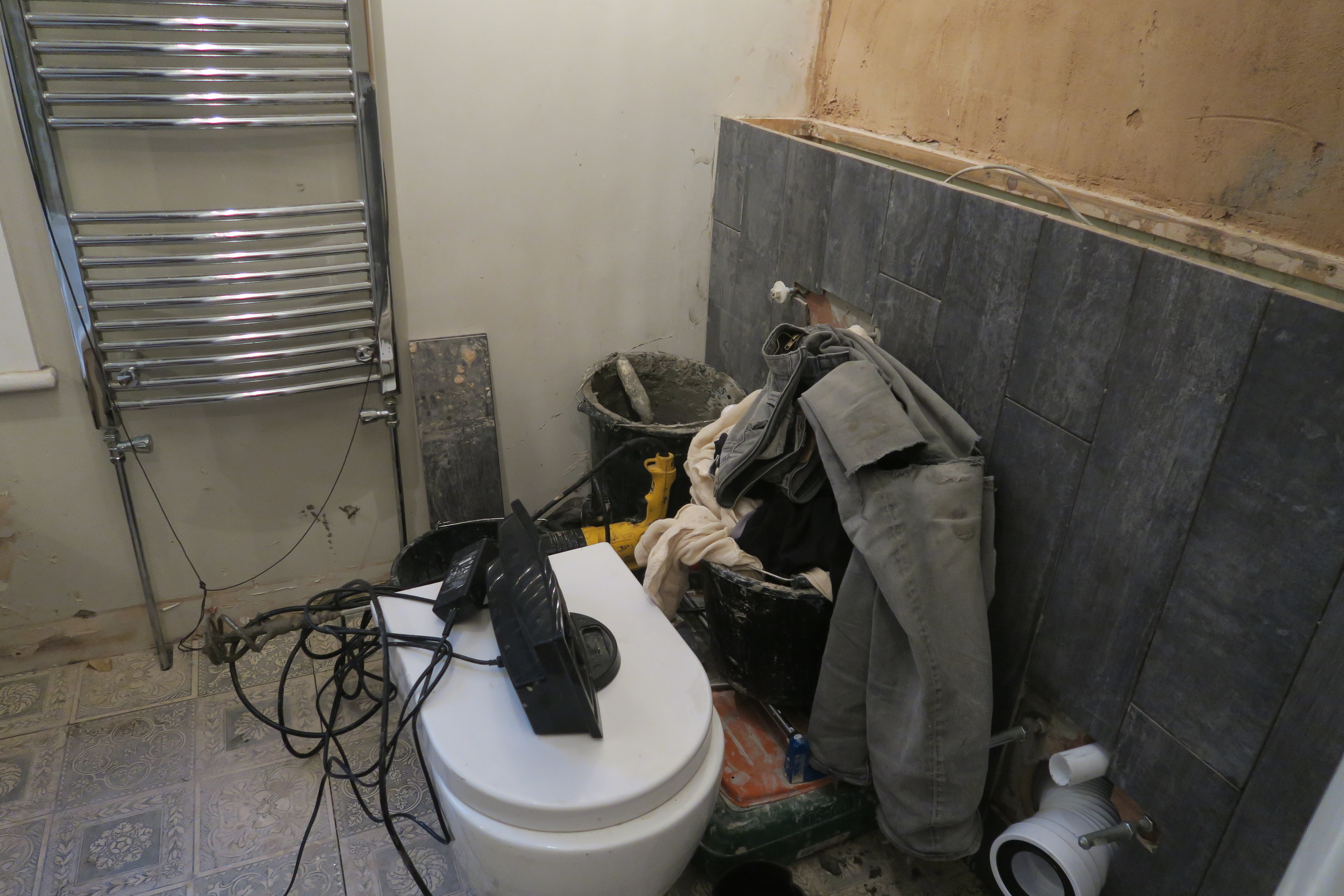
Prior to this decorating of the bathroom, I actually thought it wasn't that bad. But now comparing the old to the new photos...it was awful. Brown plastic flooring, cream walls that are only at home in a 40-a-day smokers living room and grotty peeling paint work - how did I live in this squaller!
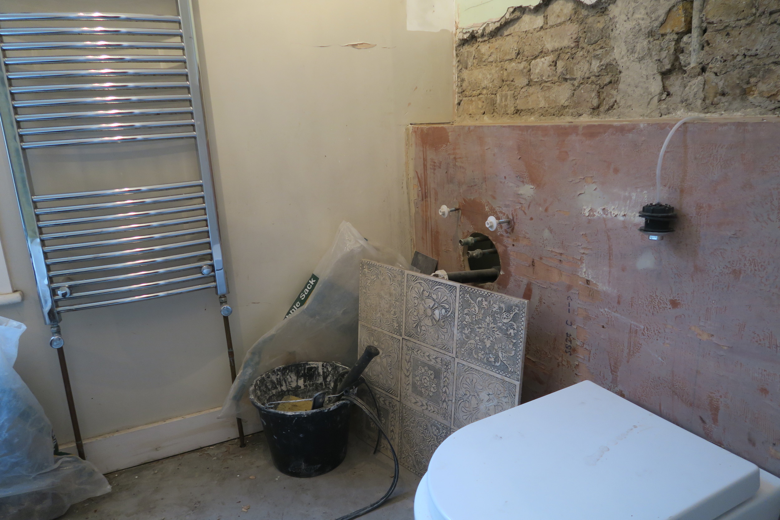
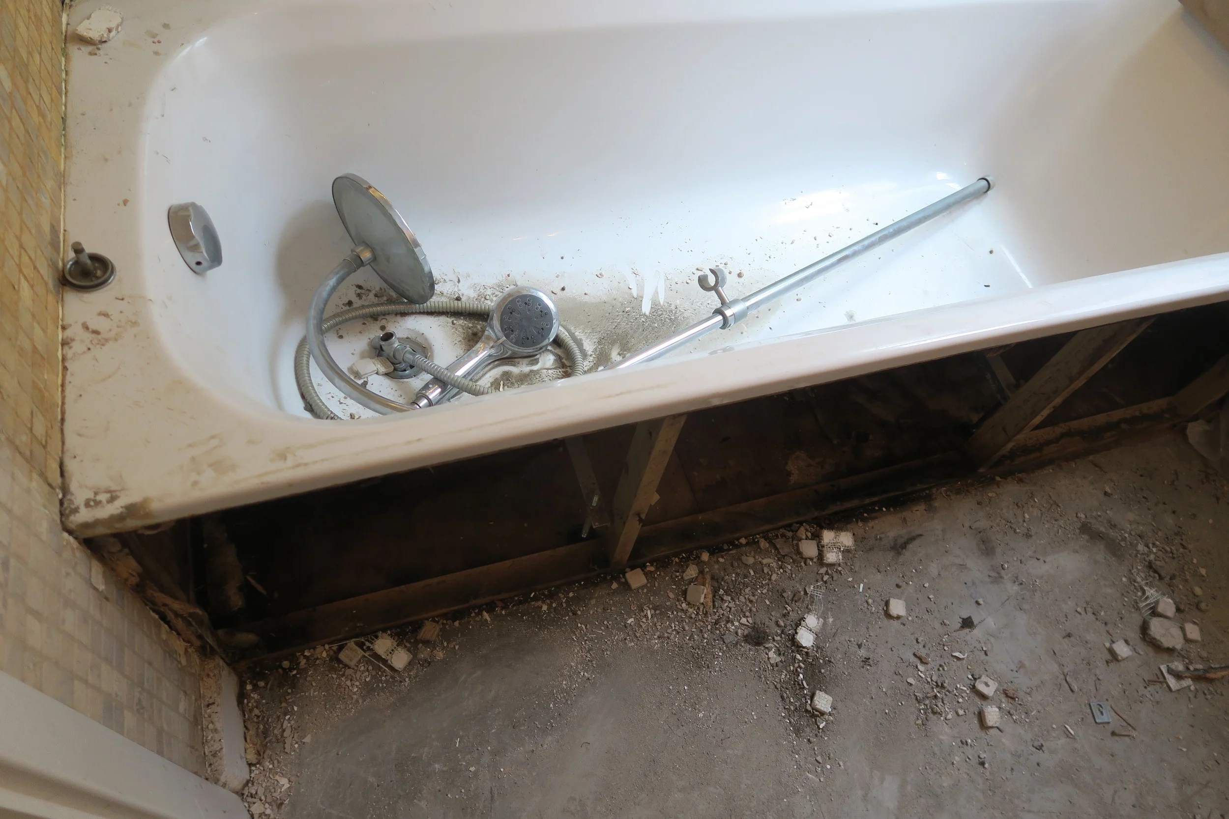
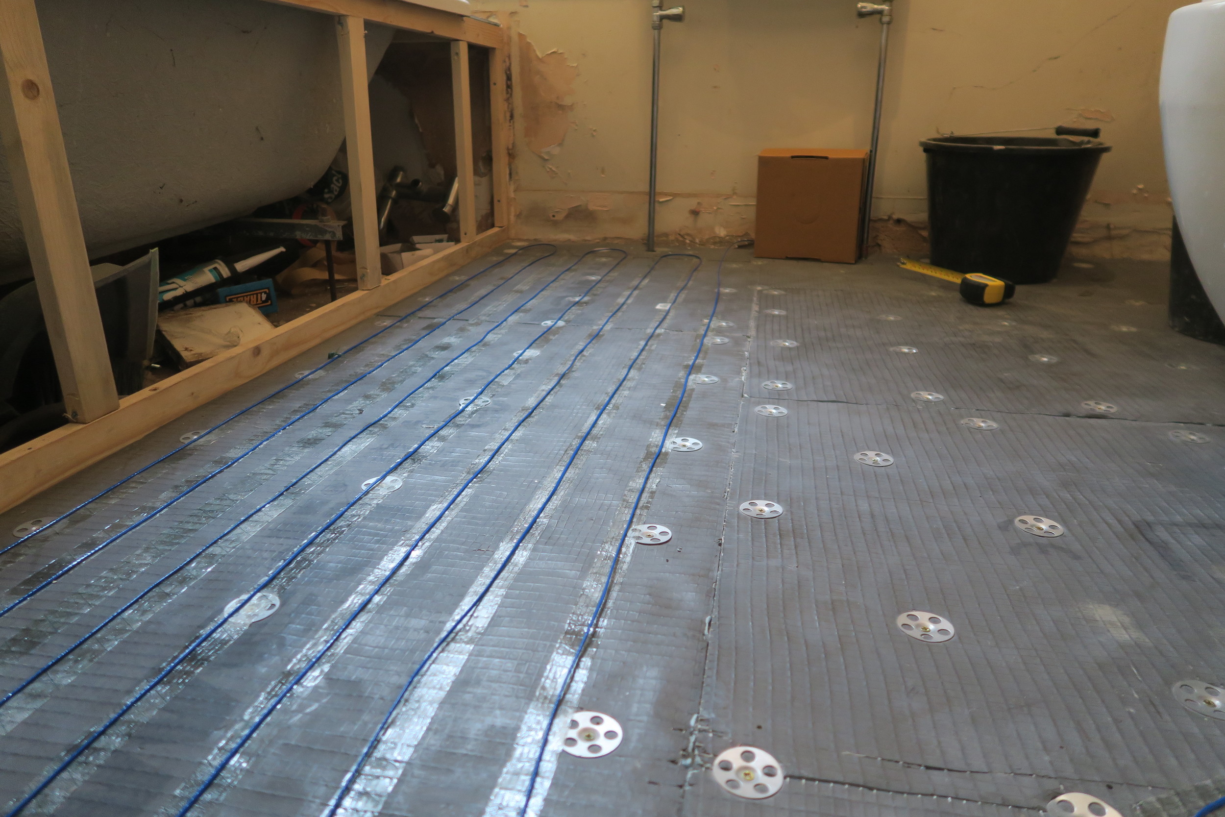
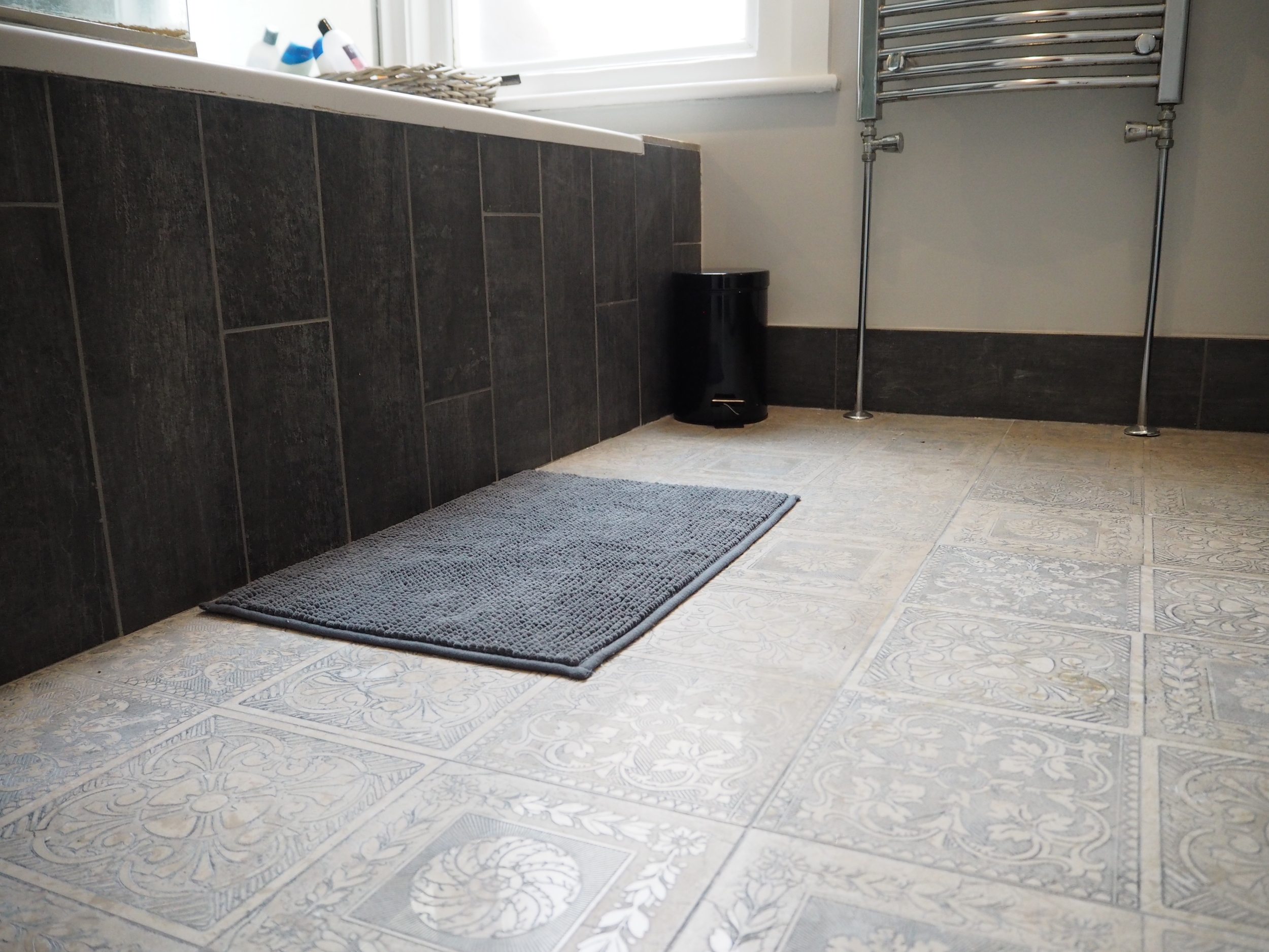
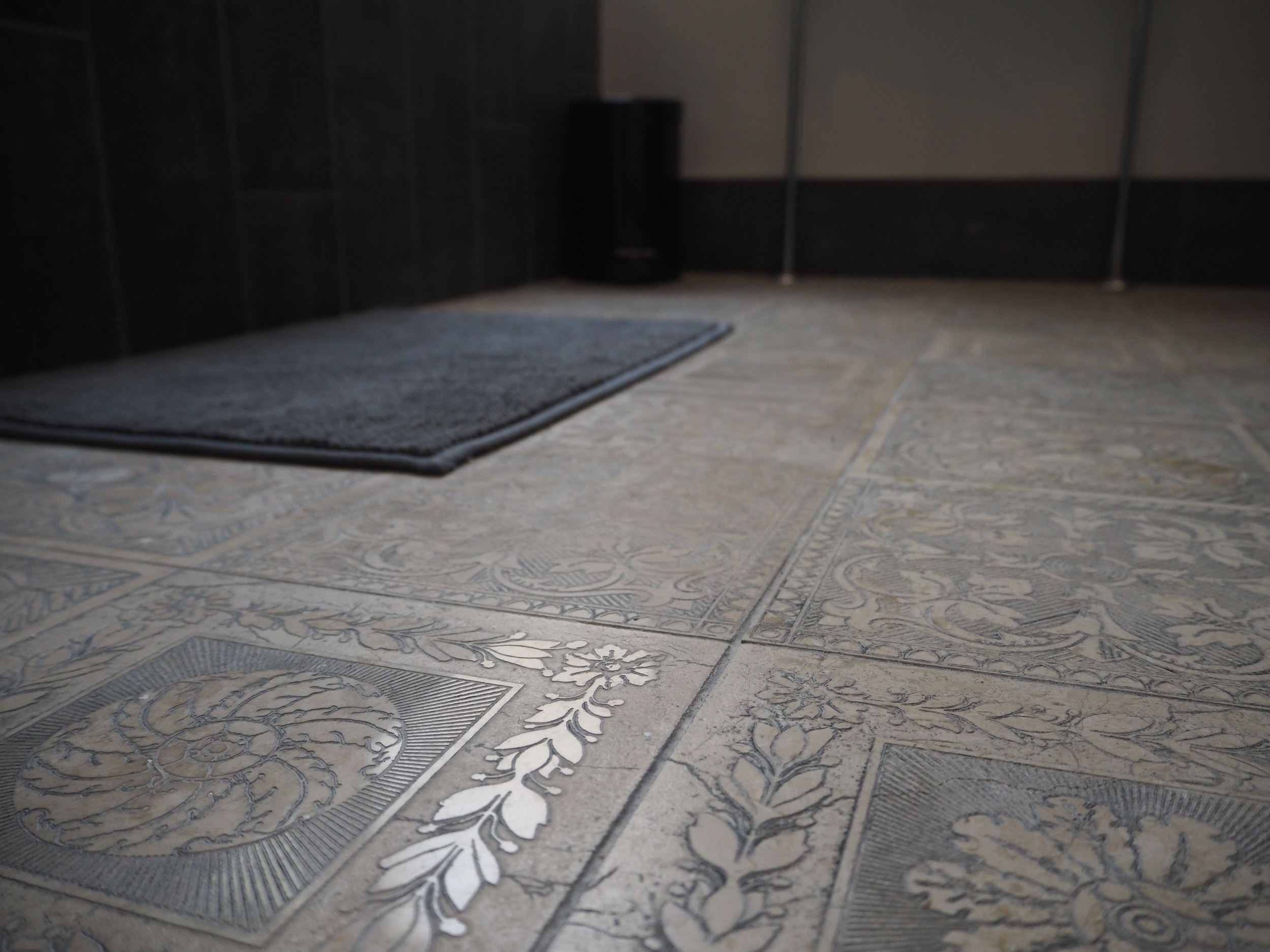
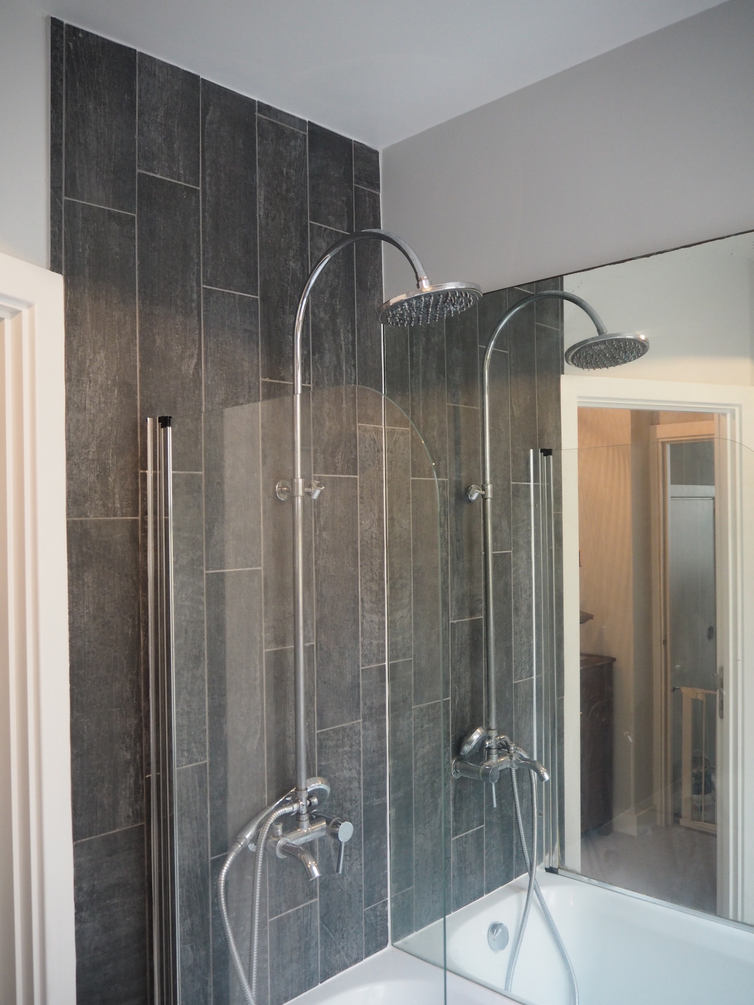
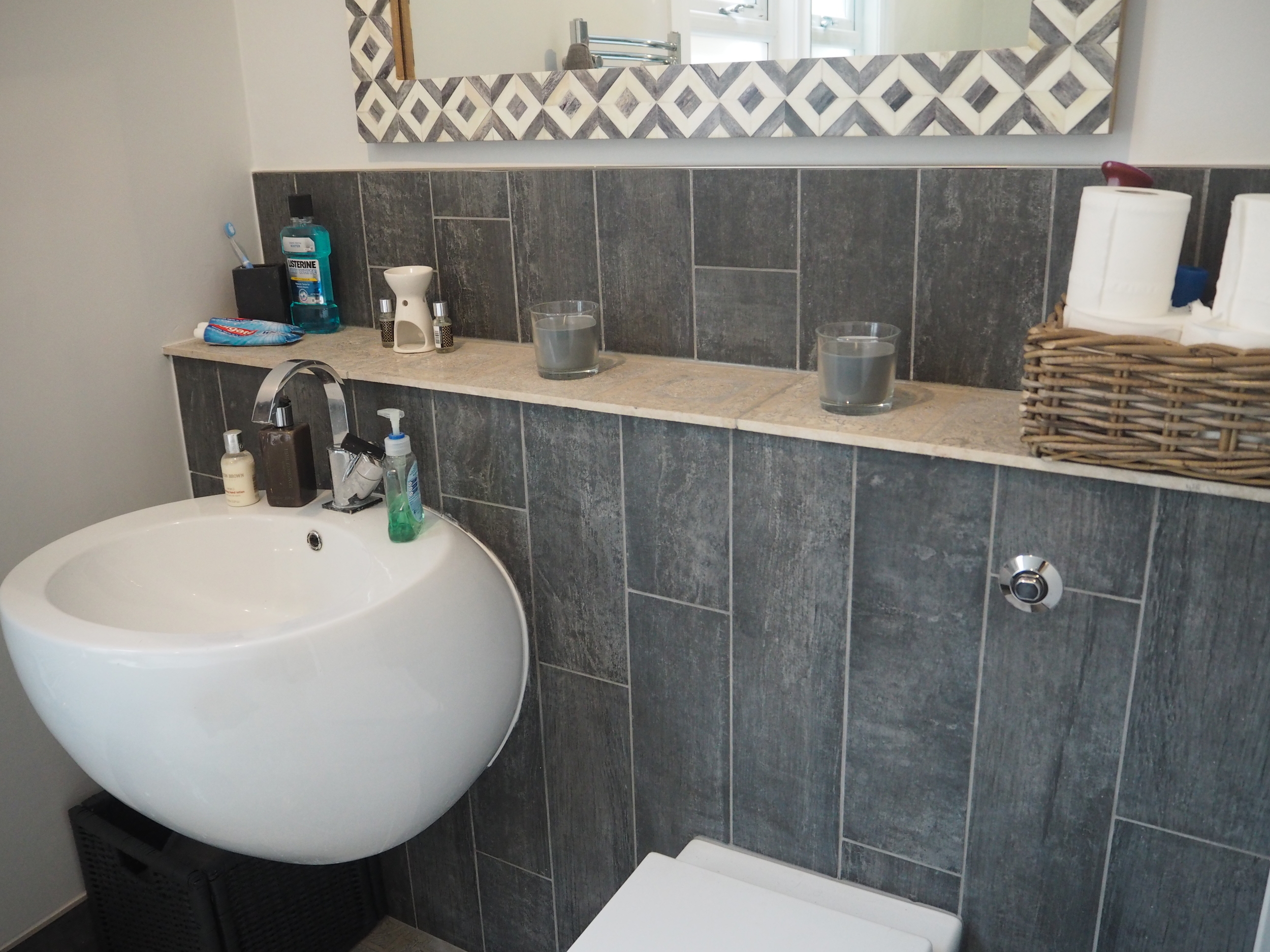
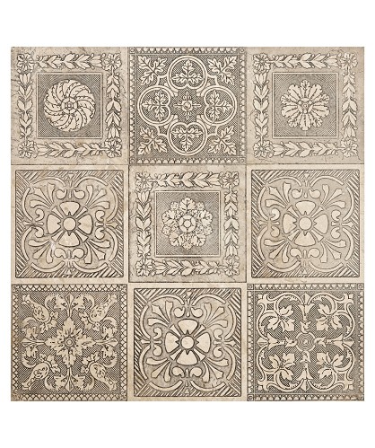
Things are taking shape. The three major purchases for the bathroom were 1. The builders costs .2. The Tiles and .3. The under floor heating. So spending all of my budget on these items, I decided to utilise the bathroom suite that I already had. My favourite purchase by a mile were the Silver Antiqued Natural Stone Floor Tiles from Topps Tiles. Because the rest of my house has been quite tonal, I wanted a big contrast in the bathroom, so I opted for dark grey/black wood effect tiles for the walls.
Underfloor heating going down...things are starting to take shape!
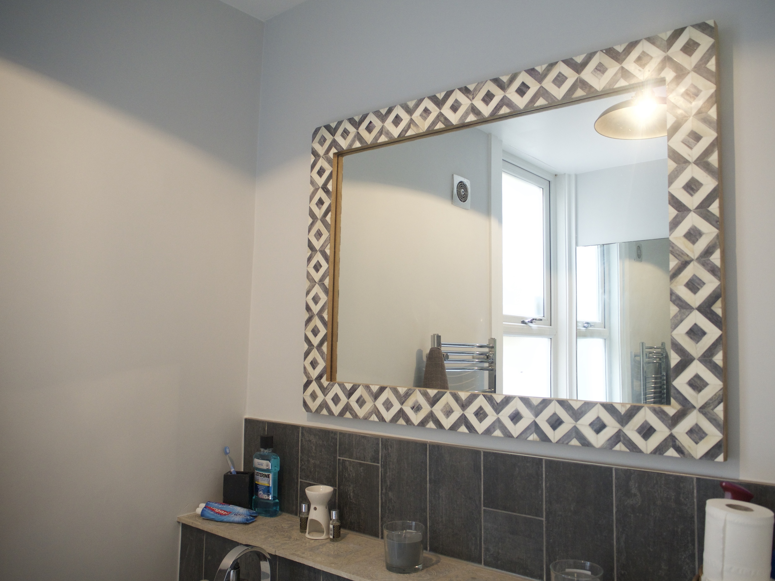
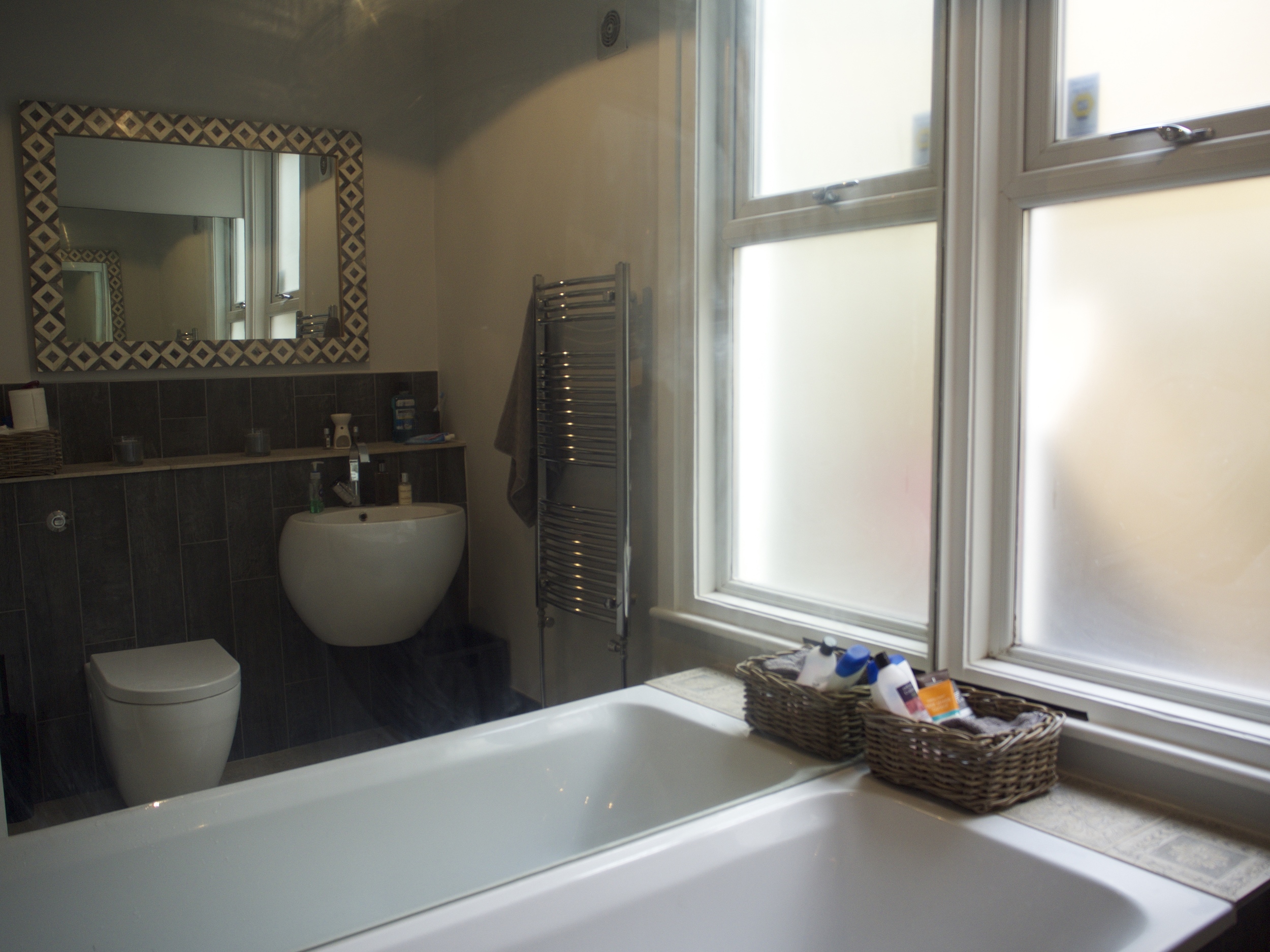
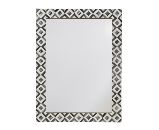
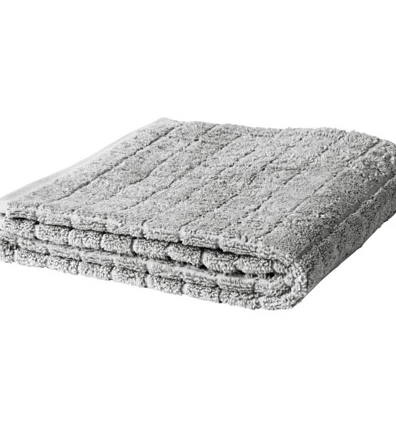
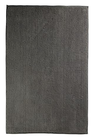
Finished! What I tried to do is make the bathroom seem as large as it could, so I removed all bulky cupboards and have opted for baskets to store my bathroom things. The towels, floor mat, bin and baskets are from Ikea and the mirror is from Loaf.
SHOP THIS INTERIOR DESIGN
Founder of this eponymous blog, focusing on men's fashion & lifestyle.


